

Why I Went Video-First With My Design Portfolio — And How You Can, Too
A practical guide to how I restructured my portfolio around video presentations.
Welcome to Unknown Arts — I’m Patrick, your field guide to AI, design, and the creative frontier. Join 7,000+ creative builders exploring what’s next.

A design portfolio is like a first date.
You can have the looks, but you won't know if there's chemistry until you talk — which is why I went video-first when I started applying to jobs again earlier this year.
Most teams don't just want to see your work. They want to know what it feels like to work with you. Video makes that visible, fast. When someone lands on my portfolio, they can immediately hear how I talk through problems, see how I communicate design intent, and get a feel for how I show up to work without having to book time with me.
In a world of remote work, async collaboration, and overloaded calendars, that just feels like the honest move for me and for anyone evaluating me.
But I didn't just drop a video on my homepage and call it a day. I rethought how I created the content of my portfolio website starting with the presentations I'm expected to give — then built everything else around that.
I’m not the only one thinking about the potential impact of video portfolios. Designer and Inflight founder, Michael Riddering, shared his thoughts on my approach in a recent edition of his show ‘Dive Club’ on Youtube. We’re in the early days, but it definitely feels like this format is on the rise.
Here’s how I approached it, step-by-step — and the results.
View the site → itspatmorgan.framer.website (no longer in use as of 2026)
View the slide deck → Figma Slides Portfolio 2025
View a sample project → Making a Complex Query Language Approachable
Working within my existing visual system
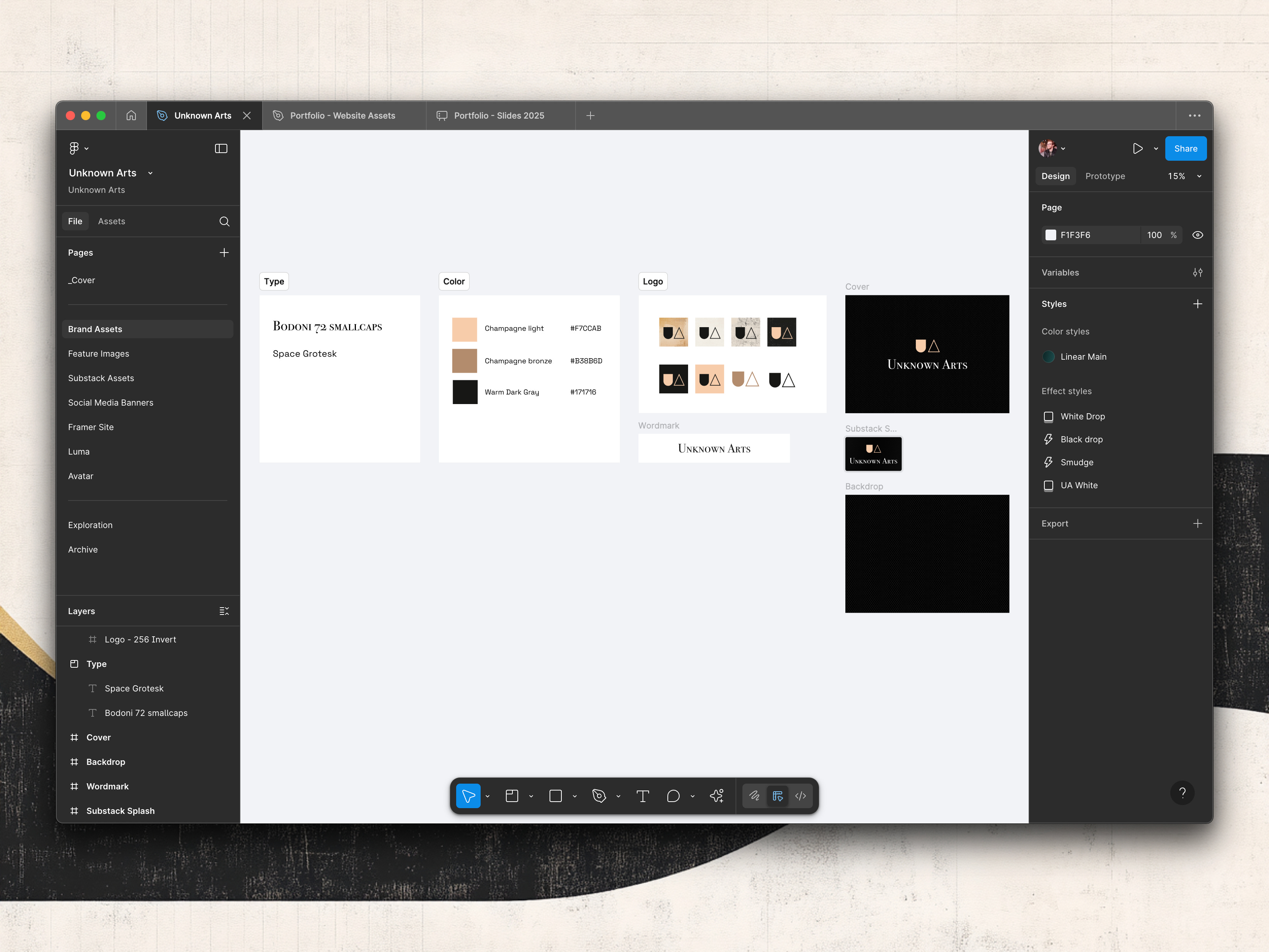
Before diving into the specifics, I want to call out that this wasn't a full brand or website redesign. I'd already designed and shipped an earlier version of my portfolio with Framer last year, and I'd spent time refining a personal visual language through my work on Unknown Arts — establishing type, color, and other styles that I liked.
That meant I could focus this effort on upgrading the content of my core projects and communication strategy.
This separation helped me focus and freed up a lot of headspace. I wasn't getting distracted by visual or UI design rabbit holes. I was focused on the clarity of the storytelling.
Starting with the presentation
Instead of jumping straight into updating my website, I began with the portfolio presentation I knew I'd have to give in interviews. I wanted to create a clear, compelling narrative for a few representative projects — each chosen to highlight different facets of my design skillset.
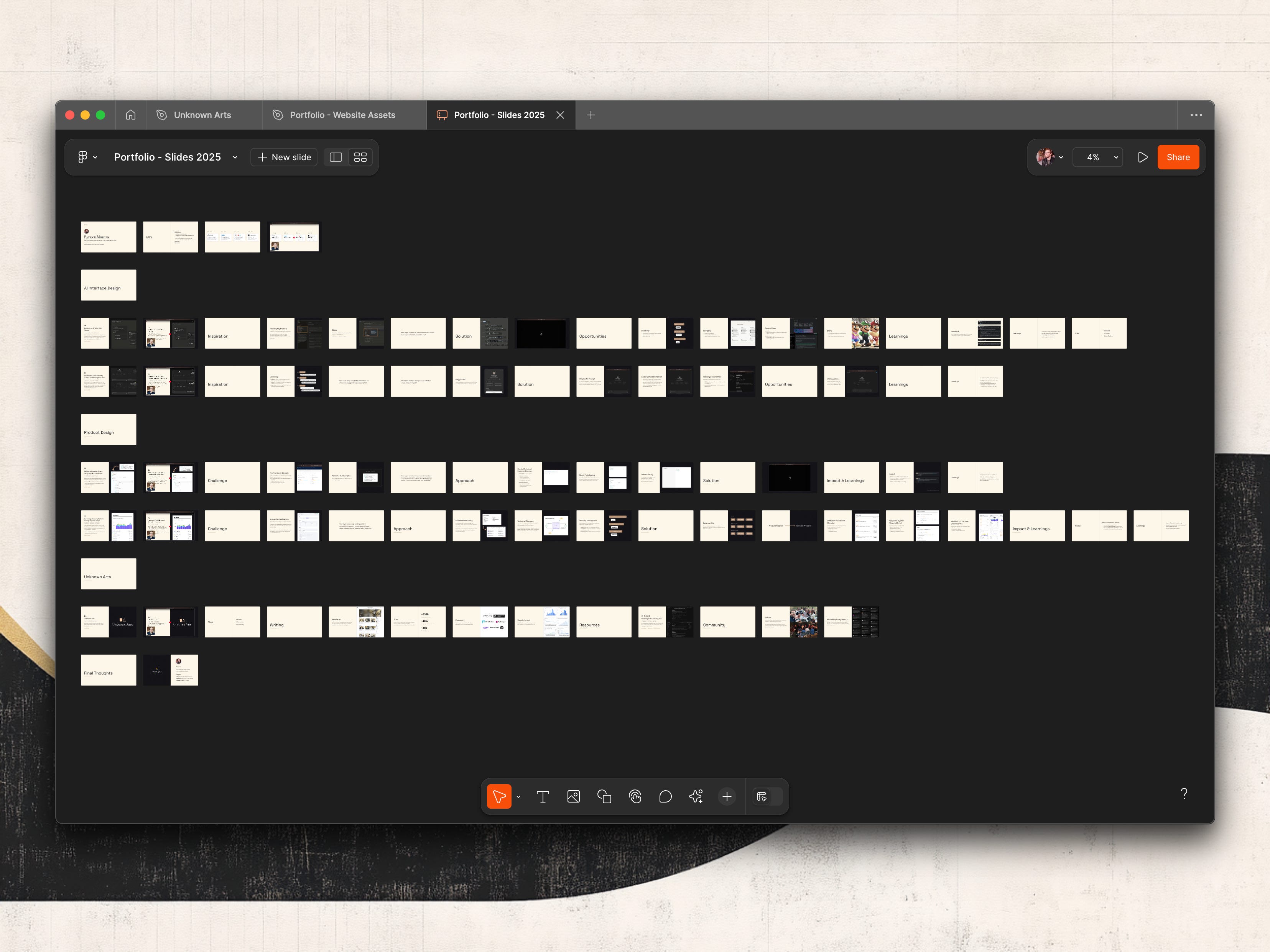
I used Figma Slides to build the presentation, keeping the process lean and in the same environment where all my assets already lived.
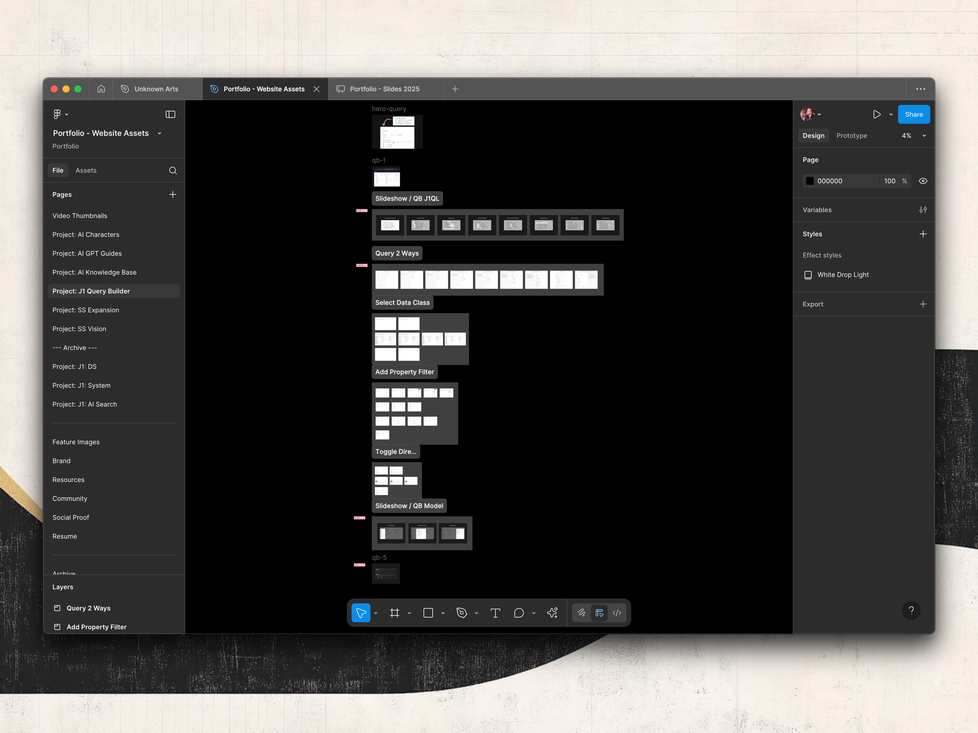
I also created a dedicated Figma file to support this process — a central place to gather existing work samples and create new visuals specifically for storytelling. This became my portfolio asset library that I could pull from as I shaped each presentation.
Refining the story by speaking it out loud
As I practiced the presentations, I found myself naturally iterating. I'd hear when the story didn't land or when I was rambling. And I’d feel when my points lacked visual support.
This speaking-first approach solved a problem I'd struggled with before when creating case studies directly as web pages: I never felt like I could strike the right balance of detail, visual aids, and storytelling. But when I had to speak my story out loud, I naturally found the right level of detail and pacing. The constraint forced clarity.
It kicked off an iterative loop:
I'd speak the story out loud
Identify gaps in the visuals or narrative
Jump into my Figma asset file to either pull an existing image or build something new
Update the story and repeat
Sometimes I needed to swap a quick screenshot. Other times I needed to design new graphics or build small prototypes. The storytelling shaped the visuals, and the visuals sharpened the story.
Each project went through this process. Over time, I compiled a master slide deck with all my material — 87 slides across four projects, a career overview, and my work on Unknown Arts. I didn’t intend to present it all at once, but it gave me a central library I could draw from depending on the audience.
Recording with purpose
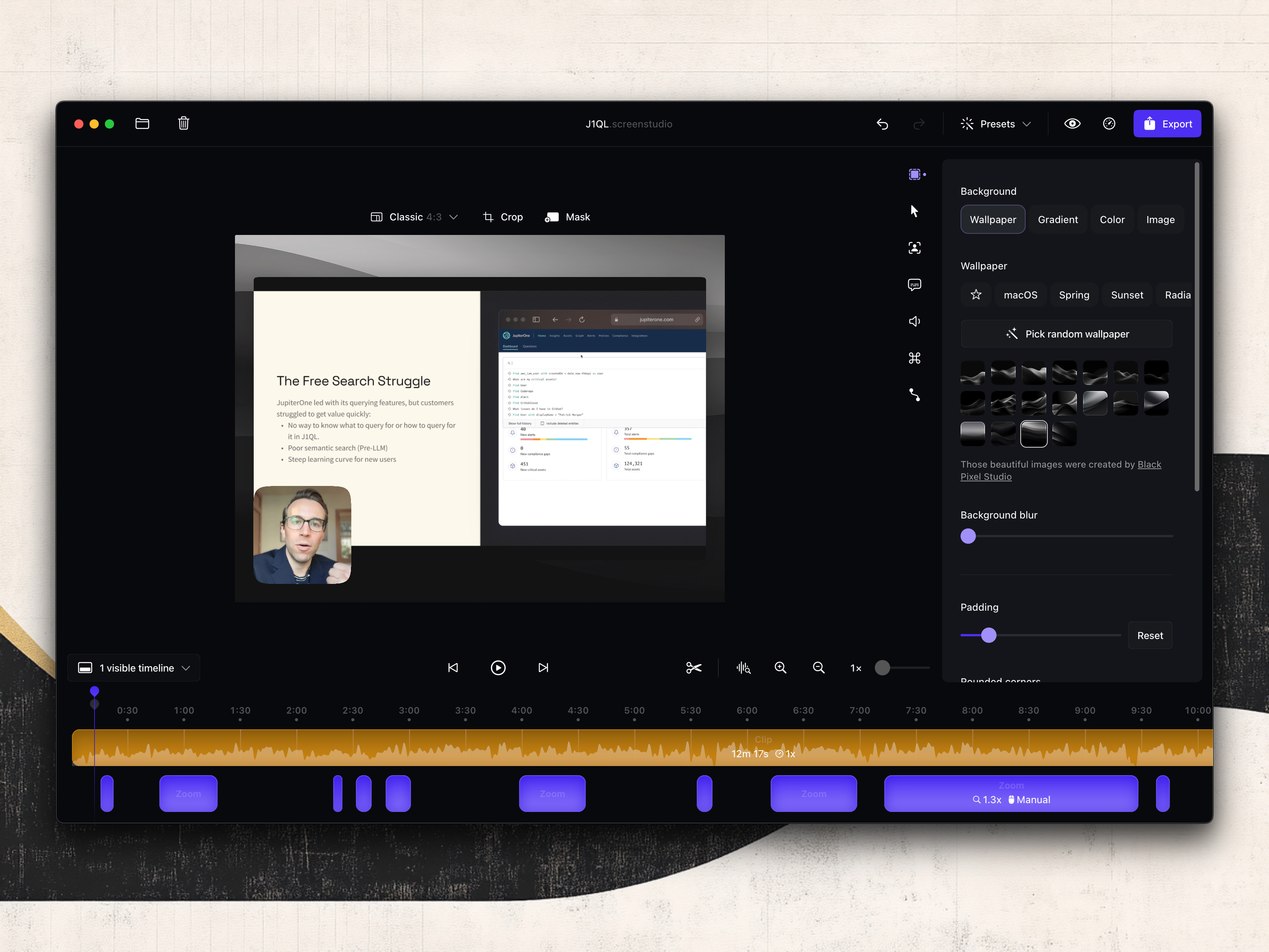
Once the presentations were tight, I recorded myself delivering each one using Screen Studio. This tool let me pan and zoom on the fly, directing the viewer's attention almost like giving a live talk.
I did multiple takes for each video — not because I wanted perfection, but because those reps helped me dial in the rhythm and clarity. The result was a set of videos that felt polished but natural, and true to how I work.
I uploaded the recordings to YouTube as unlisted videos so they'd be easy to embed in Framer but not publicly searchable. These became the centerpiece of each project page.
Retrofitting content into the site
Because I'd already shaped the story and built the assets, updating the site itself was straightforward.
This is one of those classic web design lessons: knowing what the content is makes designing the UI a lot more approachable. I wasn't guessing what to say or filling placeholders; I had the structure, narrative, and visuals dialed in. Updating the site became a matter of slotting a few new pieces into place.
For each project page, I created a consistent structure with three ways to engage:
The video — front and center for a complete walkthrough
A short text summary — highlighting core points from the presentation
The slide deck — embedded from Figma for quick visual reference
The goal was simple: progressive disclosure with a lightweight touch. Just enough structure for people to engage on their terms.
Adding interactive cues
To hint at video presence on the landing page without a major overhaul, I updated my project overview component to reveal short video snippets on hover.
For each project, I exported a few-second, muted, square video clip from the presentation and used it to replace the static project feature image on hover.
This small interaction helped signal there was more available than the typical portfolio site.
Why video makes sense now
Three forces converged to make this approach possible and, in my opinion, necessary:
The tools have made it feasible — Recording with Screen Studio, hosting on YouTube, and embedding in Framer turned what used to be a laborious video production project into an afternoon's work.
Design work demands it — Modern software design isn’t static. Interaction, flow, and animation are central to what we do and static images struggle to tell the full story.
Remote work makes it inevitable — Most of my day-to-day collaboration already happens via async content. I'm constantly sharing Slack posts with design assets, writing Notion docs, and using Loom videos to explain thinking. These videos just reflect how I communicate professionally with a bit more polish.
The early advantage
We're still early in this trend. I'm not even sure it's a first-mover advantage yet… we might just be ahead of the curve.
But I feel confident about this video-first approach because it benefits both job applicants and hiring teams. Why jump through hoops scheduling multiple calls to gather information that can be provided upfront?
As these tools become familiar and expectations shift, I believe video-first portfolios will become standard. But for now, most people still think in terms of traditional resumes, static case studies, and live presentations. There's room to stand out by being more upfront, comprehensive, and authentic than anyone expects.
Final thoughts
This whole approach is about making the first impression more real, more human, and more useful for both sides.
Video doesn't replace real conversations, but it does make them more productive. Instead of starting from zero, we begin with shared context. Instead of spending early calls figuring out basic compatibility, we can dive deeper, faster.
Top-notch execution is the baseline in today's job market. What sets you apart is how you communicate, how you collaborate, and how you show up with a team.
The setup is simple. The payoff is real.
If you can record a Loom, you can make a video-first portfolio.
And whether it leads to a job or not, the more you practice telling your story, the better it gets.
Until next time,
Patrick
PS. Yes, I wrote 1,500 words to tell you to use video. The irony’s not lost on me. Let’s just pretend I narrated it for today. 😇
Find this valuable? Share it with someone who’d appreciate it.
Want more like this? I post insights every weekday on LinkedIn — join me there.
Not subscribed yet? Get essays every Sunday — 7,000+ already do.


This is brilliant
impressed w the writeup and your approach! very cool